Wednesday, 16 November 2011

L.A.S.T 3 FINAL OUTCOMES....

for the 1st Final Artwork


Title: Tele- Communication
Tagline: Communication Revolution


Pen tool to sketch the picture
Using gradient tool instead of paint brush to paint more than one colour
Save as ai file and transfer to photoshop
Filter > Pixelate > pointillize
Adjust cell size
Adjust the level of brightness and darkness
Save as jpeg and transfer back to illustrator
Add text box into it.
Font using Playbill
Changes in effect:
Portrait and change to canvas 16inch X 20 Inch

Sketch for the 2nd Final Artwork
Title : Intrapersonal Communication
Tagline: No one live without communication


Before vs after effects


   VS


Pen tool to sketch the picture


Using gradient tool instead of paint brush to paint more than one colour
Save as ai file and transfer to photoshop
Filter > Pixelate > pointillize
Adjust cell size
Adjust the level of brightness and darkness
Save as jpeg and transfer back to illustrator
Create a text box
Font using Bernard MT Condensed & Bauhaus 93


Sketch for the 3rd Final Artwork
Title : Social Communication
Tagline:Communication gives persuasion to everyone


Tagline added
Pen tool to sketch the picture


Using gradient tool instead of paint brush to paint more than one colour
Save as ai file and transfer to photoshop
Filter > Pixelate > pointillize
Adjust cell size
Adjust the level of brightness and darkness
Save as jpeg and transfer back to illustrator
Add text box into it.
Font using Forte

Monday, 24 October 2011

18 sketches

ART MOVEMENT USED: POINTILLISM


TOPIC : COMMUNICATION


1ST 


Language x communication  


2nd


Comm tools:Social Networks


3rd
Global Communication


 4th
Intrapersonal Communication


5th


6th
Interpersonal


 7th
Family Interaction

8th

Tele-Communication 


 9th
Social Communication


10th
Isolation Group 


11th
Non-Verbal Communication


12th

13th
Animal Communication


14th
Communication Elements


 15th
Class Interaction


Pointillism


  • Was coined by JOHN ROY 
  • He continued to paint until his death in 2001.
  • His work included pointillism and photorealism and he created a remarkable and highly original body of work that represents an important contribution to the history of late twentieth century American painting.

  • Pointillism is a technique of painting in which small, distinct dots of pure color are applied in patterns to form an image.
  • Georges Seuratdeveloped the technique in 1886, branching from Impressionism. The term Pointillism was first coined by art critics in the late 1880s to ridicule the works of these artists, and is now used without its earlier mocking connotation.
  •  Neo-impressionism and Divisionism are also terms used to describe this technique of painting.


Additional

Balance
~Balance is arranging elements so that no one part of a work overpowers, or seems heavier than any other part.
~The three different kinds of balance are symmetrical, asymmetrical, and radial.
~Symmetrical (or formal) balance is when both sides of an artwork, if split down the middle, appear to be the same. ~The asymmetrical balance is the balance that does not weigh equally on both sides.
~Radial balance is equal in length from the middle.


Contrast
~Contrast is created by using elements that conflict with one another. 
~Created using complementary colors or extremely light and dark values.
~Creates interest in a piece and often draws the eye to certain areas.
~Used to make a painting look interesting


Proportion
~Proportion is a measurement of the size and quantity of elements within a composition.
~In ancient arts, proportions of forms were enlarged to show importance.
~The ancient Greeks found fame with their accurately-proportioned sculptures of the human form.
~Beginning with the Renaissance, artists recognized the connection between proportion and the illusion of 3-dimensional space.


Pattern
~Pattern and rhythm = repetition
~Show consistency with colors or lines.
~Putting a red spiral at the bottom left and top right, for example, will cause the eye to move from one spiral, to the other, and everything in between.
~It is indicating movement by the repetition of elements.
~Rhythm can make an artwork seem active.

Wednesday, 21 September 2011

G.D

Constructivism ART

~originated in Russia
~beginning in 1919
~a great effect on modern art movements of the 20th century
~major impacts upon architecture, graphic and industrial design, theatre, film, dance, fashion and to some extent music


  • Lyubov Popova (April 24, 1889 – May 25, 1924)
  • born in  Ivanovskoe
  • was a Russian avant-garde artist (Cubist,Suprematist and Constructivist), painter and designer

ARTWORKS OF THE ARTIST:
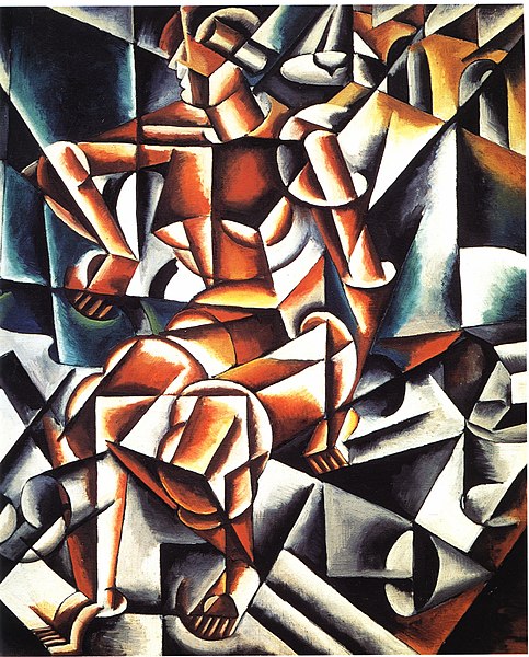
Air man space (1912)


Painterly Architectonics (1916-18)


Sketch for Portrait (1915)


Elements
@Space
~the area provided for a particular purpose
~have two dimensions (length and width)
Space includes the background, foreground and middle ground. Space refers to the distances or areas around, between or within components of a piece
~Two types of space: positive and negative space


@Color
~By the way light reflects off a surface, or in colored light sourcess
~Color and particularly contrasting color is also used to draw the attention to a particular part of the image
~There are primary colors, secondary colors, and tertiary colors


@Shape
~A shape is defined as an area that stands out from the space next to or around it due to a defined or implied boundary, or because of differences of value, color, or texture.
~ Shapes can also show perspective by overlapping.
~ Shapes in house decor and interior design can be used to add interest, style, theme to a design like a door. 


@Texture
~The quality of a surface or the way any work of art is represented.
~Lines and shading can be used to create different textures as well.


@Form
~Created by the forming of two or more shapes or as three-dimensional shape (cube, pyramid, sphere, etc.).
~Enhanced by tone, texture and colour. 
~Considered three-dimensional showing height, width and depth.


@Value
~Value, or tone, refers to the use of light and dark, shade and highlight, in an artwork.
~Black-and-white photography depends entirely on value to define its subjects
~Directly related to contrast.


@Line
~Defined as a mark that spans a distance between two points (or the path of a moving point), taking any form along the way.
~Line pertains to the use of various marks, outlines and implied lines in artwork and design, most often used to define shape in two-dimensional work.
~Implied line is the path that the viewer's eye takes as it follows shapes, colours, and form along a path, but may not be continuous or physically connected, such as the line created by a dancer's arms, torso, and legs when performing an arabesque.


Principles


Movement
~Movement shows actions, or alternatively, the path the viewer's eye follows throughout an artwork.
~Caused by using elements under the rules of the principles in picture to give the feeling of action and to guide the viewer's eyes throughout the artwork.


Emphasis
~Emphasis is the point of attraction in a piece of art that draws the viewers eye.


Unity
~Unity is the wholeness that is achieved through the effective use of the elements and principles of art.
~The arrangement of elements and principles to create a feeling of completeness.


Harmony
~Harmony is achieved in a body of work by using similar elements throughout the work, harmony gives an uncomplicated look to a piece of artwork.

~Color Harmony or Color Theory is also considered a principle through the application of the design element of color.

Variety
~Variety = alternation
~The quality or state of having different forms or types.
~The differences which give a design visual and conceptual interest: notably use of contrast, emphasis, difference in size and color.


WHAT is ART 2 mE?

ImPart

to give
to bestow
to entrust
to share
to pass on

According to Zig Ziglar ( motivational speaker), he said that " YOU don't have to be GREAT to start, but YOU have to start, to be GREAT"

~"Art is NOT a THING, it is a WAY" - Elbert Hubbard

Well, ART =
+ CREATIVE

+SCULPTURE

+STYLE

+TYPOGRAPHER


+COLORS